A few set of special buttons are dynamically drawn based on attributes.
Attributes are numerous to allow for design flexibility, however default values will always provide a usable representation.
The idea of drawn buttons came after the flexibility discovered when designing Annunciators. All annunciators are drawn buttons: Texts, frames, basic icons…
Switch
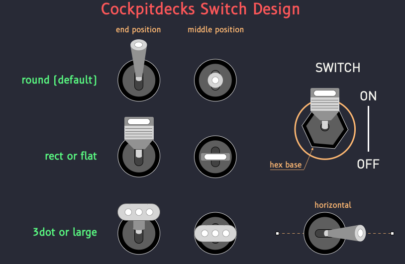
A Switch is a drawing of a two or three-way switch on an image key.
Switches are often used by On/Off activations.
They can be used in replacement of an icon.
Attributes
Ticks are marks on the side of the switch to label corresponding positions. The tick underline is the visual line line that connect all ticks.
switch:
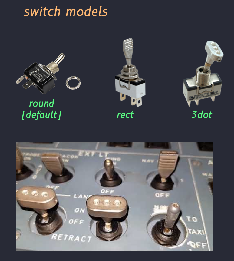
switch-style: 3dot
tick-underline: true
tick-label-size: 36
tick-label-font: DIN Bold
tick-labels:
- "ON"
- "MID"
- "OFF"
options: 3way,horizontal
Switches, Circular Switches, and Push Switches have numerous attributes in common to control their appearance. See Circular Switches for a list.
Switch Model
Switches as Drawn
Options
options: 3way
Defines a switch with 3 positions, 2 extremities, and one middle position.
options: horizontal
Draws and manipulates the switch horizontally rather than vertically.
options: hexa
Draws an hexagonal base to mimic Airbus switch inserts and fixation instead of a round base (default).
options: invert
Inverts On and Off positions.
Circular Switch
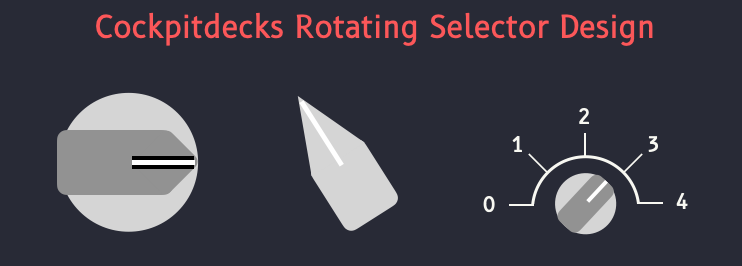
A Circular Switch is a rotating knob/switch used to represent a rotation switch. It is displayed on an image key. Circular switches are often used by Up/Down activation to cycle and bounce through the set of possible values.
They can be used in replacement of multi-icons.
    circular-switch:
      switch-style: normal
      down: 20
      left: 20
      tick-from: 135
      tick-to: 315
      tick-space: 20
      tick-underline-width: 12
      tick-color: red
      tick-underline-color: red
      needle-color: lime
      needle-length: 130
      tick-labels:
        - "0"
        - "1"
        - "2"
        - "3"
        - "4"
        - "5"
Attributes
- Button-size
- Button-stroke-color
- Button-fill-color
- Button-underline-color
- Button-underline-width
- Needle-color
- Needle-width
- Needle-underline-color
- Needle-underline-width
- Stops
- Tick-labels
- Label-font
- Label-color
- Label-size
- Tick-color
- Tick-width
- Thik-underline-color
- Thik-underline-width
- Label-space
- Thik-Space
- Top, bottom, left, right
Circular Switch Models
Circular Switches as Drawn
Push Button and Knob
button-sizebutton-colorbutton-off-colorwitness-fill-colorwitness-stroke-colorwitness-stroke-width
A PushButton is a simple button that can be used to trigger a command. It can be On or Off, and it's state can be reflected graphically by adjusting its color for instance.
Push Button Models
Later.
Push Buttons and Knob as Drawn
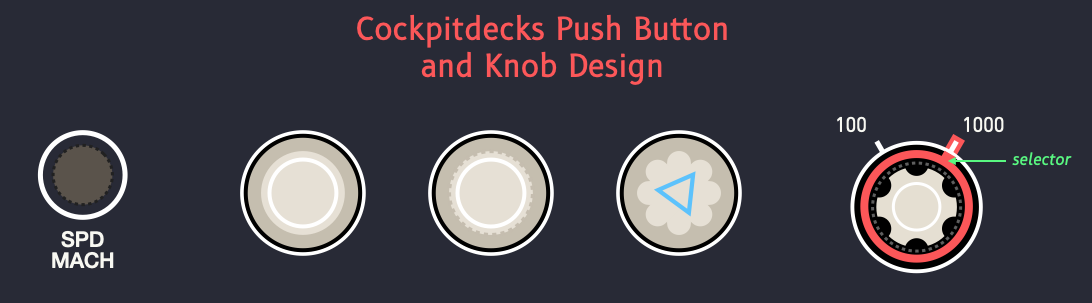
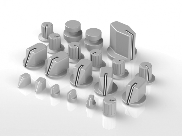
Knob
Knobs are circular rotating buttons used to set values by rotating the button clockwise or counterclockwise. Although they can be drawn and « turn » according to dataref values, they cannot currently be used with activations to trigger their rotation. Real, physical rotation knobs must be used instead. (Mimicking a rotation knob with a push button is a difficult task that requires awkward manipulations such as long pushes. We may later offer a possibility to allow for rotation knows on icon button, because the surface of some icon button (LoupedeckLive) reacts to touch and swipes. It would therefore be possible to detect precisely where the button was touched (left, right, up, center…) and assign activations accordingly.)
So we shall just say that Knob icons can be used as simple push button, with an alternative representation.